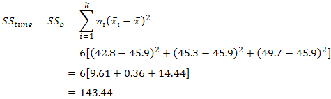
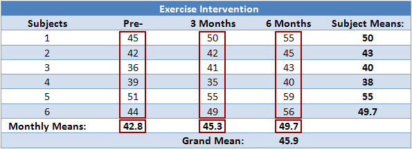
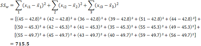
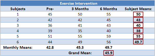
2015年5月18日 星期一

Adjust P-values for Multiple Comparisons

https://stat.ethz.ch/R-manual/R-devel/library/stats/html/p.adjust.html

p.adjust {stats}R Documentation

Adjust P-values for Multiple Comparisons

Description

Given a set of p-values, returns p-values adjusted using one of several methods.

Usage

p.adjust(p, method = p.adjust.methods, n = length(p))

p.adjust.methods
# c("holm", "hochberg", "hommel", "bonferroni", "BH", "BY",
#   "fdr", "none")

Arguments

p numeric vector of p-values (possibly with NAs). Any other R is coerced by as.numeric.
method correction method. Can be abbreviated.
n number of comparisons, must be at least length(p); only set this (to non-default) when you know what you are doing!

Details

The adjustment methods include the Bonferroni correction ("bonferroni") in which the p-values are multiplied by the number of comparisons. Less conservative corrections are also included by Holm (1979) ("holm"), Hochberg (1988) ("hochberg"), Hommel (1988) ("hommel"), Benjamini & Hochberg (1995) ("BH" or its alias "fdr"), and Benjamini & Yekutieli (2001) ("BY"), respectively. A pass-through option ("none") is also included. The set of methods are contained in the p.adjust.methods vector for the benefit of methods that need to have the method as an option and pass it on to p.adjust.
The first four methods are designed to give strong control of the family-wise error rate. There seems no reason to use the unmodified Bonferroni correction because it is dominated by Holm's method, which is also valid under arbitrary assumptions.
Hochberg's and Hommel's methods are valid when the hypothesis tests are independent or when they are non-negatively associated (Sarkar, 1998; Sarkar and Chang, 1997). Hommel's method is more powerful than Hochberg's, but the difference is usually small and the Hochberg p-values are faster to compute.
The "BH" (aka "fdr") and "BY" method of Benjamini, Hochberg, and Yekutieli control the false discovery rate, the expected proportion of false discoveries amongst the rejected hypotheses. The false discovery rate is a less stringent condition than the family-wise error rate, so these methods are more powerful than the others.
Note that you can set n larger than length(p) which means the unobserved p-values are assumed to be greater than all the observed p for "bonferroni" and "holm" methods and equal to 1 for the other methods.

Value

A numeric vector of corrected p-values (of the same length as p, with names copied from p).

References

Benjamini, Y., and Hochberg, Y. (1995). Controlling the false discovery rate: a practical and powerful approach to multiple testing. Journal of the Royal Statistical Society Series B 57, 289–300.
Benjamini, Y., and Yekutieli, D. (2001). The control of the false discovery rate in multiple testing under dependency. Annals of Statistics 29, 1165–1188.
Holm, S. (1979). A simple sequentially rejective multiple test procedure. Scandinavian Journal of Statistics 6, 65–70.
Hommel, G. (1988). A stagewise rejective multiple test procedure based on a modified Bonferroni test. Biometrika 75, 383–386.
Hochberg, Y. (1988). A sharper Bonferroni procedure for multiple tests of significance. Biometrika 75, 800–803.
Shaffer, J. P. (1995). Multiple hypothesis testing. Annual Review of Psychology 46, 561–576. (An excellent review of the area.)
Sarkar, S. (1998). Some probability inequalities for ordered MTP2 random variables: a proof of Simes conjecture. Annals of Statistics 26, 494–504.
Sarkar, S., and Chang, C. K. (1997). Simes' method for multiple hypothesis testing with positively dependent test statistics. Journal of the American Statistical Association 92, 1601–1608.
Wright, S. P. (1992). Adjusted P-values for simultaneous inference. Biometrics 48, 1005–1013. (Explains the adjusted P-value approach.)

See Also

pairwise.* functions such as pairwise.t.test.

Examples

require(graphics)

set.seed(123)
x <- rnorm(50, mean = c(rep(0, 25), rep(3, 25)))
p <- 2*pnorm(sort(-abs(x)))

round(p, 3)
round(p.adjust(p), 3)
round(p.adjust(p, "BH"), 3)

## or all of them at once (dropping the "fdr" alias):
p.adjust.M <- p.adjust.methods[p.adjust.methods != "fdr"]
p.adj    <- sapply(p.adjust.M, function(meth) p.adjust(p, meth))
p.adj.60 <- sapply(p.adjust.M, function(meth) p.adjust(p, meth, n = 60))
stopifnot(identical(p.adj[,"none"], p), p.adj <= p.adj.60)
round(p.adj, 3)
## or a bit nicer:
noquote(apply(p.adj, 2, format.pval, digits = 3))


## and a graphic:
matplot(p, p.adj, ylab="p.adjust(p, meth)", type = "l", asp = 1, lty = 1:6,
        main = "P-value adjustments")
legend(0.7, 0.6, p.adjust.M, col = 1:6, lty = 1:6)

## Can work with NA's:
pN <- p; iN <- c(46, 47); pN[iN] <- NA
pN.a <- sapply(p.adjust.M, function(meth) p.adjust(pN, meth))
## The smallest 20 P-values all affected by the NA's :
round((pN.a / p.adj)[1:20, ] , 4)

[Package stats version 3.3.0 Index]

2015年5月14日 星期四

repeated measures ANOVA 統計概念

https://statistics.laerd.com/statistical-guides/repeated-measures-anova-statistical-guide.php

  1. one-way repeated measures ANOVA.
  2. This particular test requires one independent variable and one dependent variable.
  3. The dependent variable needs to be continuous (interval or ratio) and the independent variable categorical (either nominal or ordinal).


Hypothesis for Repeated Measures ANOVA

H0: states that the means are equal
HA: at least two means are significantly different

If your repeated measures ANOVA is statistically significant, you can run post hoc tests that can highlight exactly where these differences occur.

Logic of the Repeated Measures ANOVA


In this design, within-group variability (SSw) is defined as the error variability (SSerror). Following division by the appropriate degrees of freedom, a mean sum of squares for between-groups (MSb) and within-groups (MSw) is determined and an F-statistic is calculated as the ratio of MSb to MSw (or MSerror), as shown below:
Partitioning of Variability in a Repeated Measures ANOVA


F statistic for an independent ANOVA


 A repeated measures ANOVA calculates an F-statistic in a similar way:
F statistic for a Repeated Measures ANOVA


Error Comparison between an Independent vs. Repeated Measures ANOVA


Partitioning of Variability between an Independent vs. Repeated Measures ANOVA

Error Comparison between an Independent vs. Repeated Measures ANOVA


SSconditions: They both represent the sum of squares for the differences between related groups.

Formula for the F-statistic for a Repeated Measures ANOVA


Calculating SStime

 Table for Sum of Squares for Time

Solved Formula or Sum of Squares for Time 

Calculating SSw

 Table for Sum of Squares for Within Groups

Solved Formula for Sum of Squares for Within Groups 

Calculating SSsubjects


Table for Sum of Squares for Subjects 

Solved Formula for Sum of Squares for Subjects 


Solved Formula for Sum of Squares for Error 


Determining MStime, MSerror and the F-statistic

To determine the mean sum of squares for time (MStime) we divide SStime by its associated degrees of freedom (k - 1), where k = number of time points. In our case:
Solved Formula for Mean Sum of Squares for Time 

We do the same for the mean sum of squares for error (MSerror), this time dividing by (n - 1)(k - 1) degrees of freedom, where n = number of subjects and k = number of time points. In our case:
Solved Formula for Mean Sum of Squares for Error
Therefore, we can calculate the F-statistic as:
Solved Formula for F-statistic 

We report the F-statistic from a repeated measures ANOVA as:
F(dftime, dferror) = F-value, p = p-value
which for our example would be:
F(2, 10) = 12.53, p = .002

The six-month exercise-training programme had a statistically significant effect on fitness levels, F(2, 10) = 12.53, p = .002.


Repeated Measures ANOVA Output Table


Increased Power in a Repeated Measures ANOVA


The major advantage with running a repeated measures ANOVA over an independent ANOVA is that the test is generally much more powerful. This particular advantage is achieved by the reduction in MSerror (the denominator of the F-statistic) that comes from the partitioning of variability due to differences between subjects (SSsubjects) from the original error term in an independent ANOVA (SSw): i.e. SSerror = SSw - SSsubjects. We achieved a result of F(2, 10) = 12.53, p = .002
we would have ended up with a result of F(2, 15) = 1.504, p = .254, for the independent ANOVA. We can clearly see the advantage of using the same subjects in a repeated measures ANOVA as opposed to different subjects. For our exercise-training example, the illustration below shows that after taking away SSsubjects from SSw we are left with an error term (SSerror) that is only 8% as large as the independent ANOVA error term.


Comparison of Error Terms between Independent vs. Repeated Measures ANOVA 

This does not lead to an automatic increase in the F-statistic as there are a greater number of degrees of freedom for SSw than SSerror. However, it is usual for SSsubjects to account for such a large percentage of the within-groups variability that the reduction in the error term is large enough to more than compensate for the loss in the degrees of freedom (as used in selecting an F-distribution).


Effect Size for Repeated Measures ANOVA


It is becoming more common to report effect sizes in journals and reports. Partial eta-squared is where the the SSsubjects has been removed from the denominator (and is what is produced by SPSS):

Formula for Effect Size Eta Squared for Repeated Measures ANOVA 

So, for our example, this would lead to a partial eta-squared of:

Solved Formula for Effect Size Eta Squared for Repeated Measures ANOVA 


Underlying Assumptions: Normality

Similar to the other ANOVA tests, each level of the independent variable needs to be approximately normally distributed.  


Graphics with error bars

Next we will demonstrate how to use R’s powerful graphics functions to add error bars to a plot. The example uses the Elashoff example discussed earlier. In this example we will briefly show how visual representations compliment the statistical tests. We use R’s jpg() graphics driver to generate a graph that can be viewed by a web browser. The command syntax may appear intimidating for beginners, but it is worth the increased efficiency in the long run.
You can also use the postscript() graphics driver to generate presentation-quality plots. PostScript files can be transformed into PDF format so that nowadays the graphs generated by R can be viewed and printed by virtually anyone.11
Typically the graphs are first generated interactively with drivers like X11(), then the commands are saved and edited into a script file. A command syntax script eliminates the need to save bulky graphic files.
First we start the graphics driver jpg() and name the file where the graph(s) will be saved.
attach(Ela.uni)
jpeg(file = "ElasBar.jpg")
Then we find the means, the standard errors, and the 95% confidence bounds of the means.
tmean <- tapply(effect, IND = list(gp, drug, dose), mean)
tse   <- tapply(effect, IND = list(gp, drug, dose), se)
tbarHeight <- matrix(tmean, ncol=3)
dimnames(tbarHeight) <- list(c("gp1dr1","gp2dr1","gp1dr2","gp2dr2"), 
          c("dose1","dose2" ,"dose3")) 
tn <- tapply(effect, IND = list(gp, drug, dose), length)
tu <- tmean + qt(.975, df=tn-1) * tse    # upper bound of 95% confidence int.
tl <- tmean + qt(.025, df=tn-1) * tse    # lower bound
tcol <- c("blue", "darkblue", "yellow", "orange")  # color of the bars
After all the numbers are computed, we start building the barplot. First we plot the bars without the confidence intervals, axes, labels, and tick marks. Note that the barplot() function returns the x-axis values at where the center of the bars are plotted. Later we will use the values in tbars to add additional pieces.
tbars <- barplot(height=tbarHeight, beside=T, space=c(0, 0.5), 
                 ylab="", xlab="", axes=F, names.arg=NULL, ylim=c(-15, 40), 
                 col=tcol)
Then we add the 95% confidence intervals of the means to the bars.
segments(x0=tbars, x1=tbars, y0=tl, y1=tu)
segments(x0=tbars-.1, x1=tbars+0.1, y0=tl, y1=tl)    # lower whiskers
segments(x0=tbars-.1, x1=tbars+0.1, y0=tu, y1=tu)    # upper whiskers
The axes labels are added.
axis(2, at = seq(0, 40, by=10), labels = rep("", 5), las=1)
tx <- apply(tbars, 2, mean)   # center positions for 3 clusters of bars
We plot the horizontal axis manually so that we can ask R to put things at exactly where we want them.
segments(x0=0, x1=max(tbars)+1.0, y0=0, y1=0, lty=1, lwd = 2)
text(c("Dose 1", "Dose 2", "Dose 3"), x = tx, y = -1.5, cex =1.5)
mtext(text=seq(0,40,by=10), side = 2, at = seq(0,40,by=10), 
      line = 1.5, cex =1.5, las=1)
mtext(text="Drug Effectiveness", side = 2, line = 2.5, at = 20, cex =1.8)
Finally we want to plot the legend of the graph manually. R also has a legend() function, although less flexible.
tx1 <- c(0, 1, 1, 0)
ty1 <- c(-15, -15, -13, -13)
polygon(x=tx1, y=ty1, col=tcol[1])
polygon(x=tx1, y=ty1 + 2.5, col=tcol[2])  # 2nd, moved 2.5 points up
polygon(x=tx1, y=ty1 + 5, col=tcol[3])    # 3rd
polygon(x=tx1, y=ty1 + 7.5, col=tcol[4])  # last
Finally, we add the legend labels for the filled rectangles.
text(x = 2.0, y = -14, labels="group 1, drug 1",  cex = 1.5, adj = 0)
text(x = 2.0, y = -11.5, labels="group 2, drug 1",  cex = 1.5, adj = 0)
text(x = 2.0, y = -9, labels="group 1, drug 2",  cex = 1.5, adj = 0)
text(x = 2.0, y = -6.5, labels="group 2, drug 2",  cex = 1.5, adj = 0)
The greatest effectiveness is attained by subjects in group 2 when drug 2 is given. This suggests a group by drug interaction, which is confirmed by the aov() results outlined earlier. It also indicates an increasing effectiveness from dose 1 to 3, which is also confirmed by the statistics.


7.8.8  Another way to do error bars using plotCI()

The gplots library has a function plotCI(), which does confidence intervals for plots. Here is an example, which is Figure 1 in http://journal.sjdm.org/06137/jdm06137.htm. Note the use of a small horizontal offset (−.01) so that the error bars do not overlap. The font “NimbusSan” is supposed to fit well with Times Roman.
library("gplots")
m.pg <- c(-2.6400, 3.6000, 6.0000, 3.6800, 5.4400)
se.pg <- c(1.71938, 1.86548, 1.74738, 1.94484, 1.83492)
m.pl <- c(-4.9600, -3.7600, -2.3200, -.1600, 6.5600)
se.pl <- c(1.47024, 1.72170, 1.79139, 1.36587, 1.56852)

postscript(file="fig1.eps",family="NimbusSan",
           width=8,height=8,horiz=F,pointsize=18,paper="special")
plotCI(y=c(m.pg,m.pl),x=c(c(1:5)-.01,c(1:5)+.01),uiw=c(se.pg,se.pl),
       ylim=c(-6,8),ylab="Net IGT score",xlab="Block",lty=rep(c(1,2),c(5,5)))
lines(y=m.pg,x=c(1:5)-.01,lty=1)
lines(y=m.pl,x=c(1:5)+.01,lty=2)
legend(3.6,-3.7,legend=c("Prior gain","Prior loss"),lty=c(1,2))
dev.off()

Repeated measures ANOVA 的種類

aov {stats}
Anova {car}
ezANOVA {ez}: The ez package also offers the functions ezPlot and ezStats to give plot and statistics of the ANOVA analysis.
friedman.test {stats}